Anna Pogossova

The saccharine provinces conjured up by Moscow-born, Sydney-based artist and still-life photographer Anna Pogossova unpack what is assumed, albeit without words. To Pogossova, colour is “highly symbolic and has a way of influencing interpretation in profound ways”. “To quote Miranda Priestly, ‘It’s not just blue’. Colour comes from something more elusive and otherworldly,” she says. Fitting, then, that her work “Ø Portal Entry (The Acrylic Age)” configures folkloric shapes with the familiar texture of smooth plastic toys, theme-park rides and waterslides. Constructed from pigment paint, this fictitious playground emerges from its goopy residue to create a speculative environment which deconstructs form and function. It’s not too dissimilar to Salvador Dalí’s surreal landscapes. What will emerge next through the arched passageway is anyone’s guess. Yet without fail, you can rely on a vivid palette to be Pogossova’s perennial building block. Cinematic techniques, pop culture motifs and science-fiction elements are an additional framework to convey these fantasy lands. These are tools Pogossova uses in her work to trigger associations. “What [the pieces] are and how they are made is much less important than their ability to transport us.”
Courtesy of Jerico Contemporary.
Sarah Morris

Sarah Morris began her career as an assistant to one of the 20th century’s greatest satirists, Jeff Koons. Rather than using humour or irony to impart modernity, Morris fuses structural lines with vibrant patterns. The result? A captivating piece that is equal parts multifarious as it is mechanical. In this work, titled “You Cannot Keep Love” from her 2020 Sound Graph series, Morris utilises household gloss paint in an interplay between natural and manufactured assemblies. Her relation to global cities is crucial to her designs. Knowing this, one viewer may see skyscrapers; another may perceive an optical illusion of tessellating parts moving together. These different interpretations are exactly what Morris hopes for, with the name of the series inspired by German filmmaker, poet, and lawyer, Alexander Kluge. “[Alexander and I] were speaking about the role of the artist in relation to their audience, and that you cannot dictate or control what goes on,” Morris says. From this, voice work and sonics arose as the central focus. “It’s impossible to think about my work and the city without sound,” Morris says.
Courtesy of White Cube.
Daniel Domig

Jutted and protruding limbs in washes of eggplant, tangerine and midnight blue aren’t what we see in our reflections. But what if Daniel Domig’s rendering of the human form is the real mirror image? With this work, the Vienna-based painter reimagines figures in relation to themselves. “We live in a time where we seem to have forgotten how beautiful fragmentation – the plethora of perspectives and experiences – can be,” he says of his inorganic subjects. “From political to personal, we search for the simple and often one-dimensional aspects of life. I like to lean in the opposite direction.” This consciously defiant act encourages more room for the uncertain, unfinished and imperfect parts of ourselves – a theme that’s carried through in each stroke. Domig’s use of thin layers of oil paint demands further inspection to spot the multicolour particles hiding within a monochrome palette. He likens this process to his childhood evenings in Vancouver. “When I was young, I often marvelled at the colours I could see in the dark that weren’t visible when my mother first turned off the light,” he says. “Art is a lab to explore vision, time and transformation.”
Courtesy of Chalk Horse.
Lucy O’Doherty

English philosopher Alain de Botton once mused about the domesticity of life. “It’s not necessarily at home that we best encounter our true selves,” he said. Contemporary painter and drawer Lucy O’Doherty evokes the everyday qualities of habitual settings and filters them through a soft, lucid haze. Take the setting of “The First Room.” Plush banquette arrangements, an amber glow, and an abandoned Hellenistic sculpture. Inspired by the similarity between a restaurant with “provided food and muffled sounds” to the experience of being in the womb, the piece morphs into something more evocative than a graphic, empty dining hall. This evolution is intrinsic to her creative process. Self-admittedly, the dreamlike quality of the space is a result of O’Doherty recalling this scene from memory. Beginning with recollections from places she’s been to in the waking world and in her dreams, the artist says she “starts at a particular location and with an initial black line sketch devoid of colour”. “After some time has passed, I revisit the initial sketch and then choose a palette based on how I remember it making me feel.” The tones are self-explanatory in this instance but the composition is more ruminative than it seems.
Courtesy of China Heights.
Andrew Taylor

Bursts of vibrant streaks explode across Andrew Taylor’s linen surface like fireworks on a balmy summer evening. These transient eruptions are liquid light, interrupting celestial domains with flashes of fleeting radiance. In this work, faithfully titled “Outside: September Holidays I 9:11”, these optical patterns find a place independent of the sky. In Taylor’s mind, an imperceptible, transient moment may bear no significance to the everyday individual – but like those who look through a kaleidoscope, artists find beauty in cursory glances and rare moments that exist for only a second. This progression from mundane to art is what Taylor encapsulates in each of his pieces. “Each picture gives the painter the chance to make a journey,” he says. “Here, I wanted a pulse, an energy, a rapture that I felt long ago.” This notion of a crossing continues through Taylor’s palette; hacienda magentas, burnt yellows and cerulean blues in the shapes of erupting fronds. “Colour, for me, is at the beginning and there as it ends. It provokes, guides, inspires.”
Courtesy of Olsen Gallery.
Nick Heard

“I remember feeling like I had cheated in making this painting, because there was no struggle,” says New Zealand-born artist Nick Heard of “Paper Fields”. Working with a thick application of paint technically referred to as impasto, this piece from the artist’s Dear Georgie, I’ve Been Painting series reframes a botanical still-life image into an enchanting and technicolour reverie. Each stroke of Heard’s palette knife reveals and conceals an underlying hue. Across a matter of days, Heard paints a single bouquet, capturing how its flowers bloom and wilt over time. In this case, an Australian native arrangement sat on a stool in his Sydney studio with a corrugated iron background reflecting lines of light. “In the moment, I grabbed the unopened green tube off the studio floor and emptied it directly onto the canvas,” he remembers. “It all happened very quickly and luckily, it fell into place.” A moment of discord resulted in a resonance of tones and texture – an apt outcome for the artist who sees “music” in this method.
Courtesy of Jerico Contemporary.
Sally Scales

“My inspiration is always my homeland,” says proud Pitjantjatjara woman, leader and artist Sally Scales. Hailing from the far west Aṉangu Pitjantjatjara Yankunytjatjara (APY) Lands in remote South Australia, Scales’ connection to The Dreaming – ‘Tjukurpa’ in her native, near-extinct language – is the tether that binds her entire body of work. Typically working on large-scale linen canvases, “337-23AS” is a rather restrained acrylic work that tells the story of her country, identity and ancestors. “When I paint on canvas I can throw the paint and create many layers. On paper, I have to be very deliberate. I’m limited down to only five,” Scales shares. “Colour always informs my approach, but in a different way. [Here], it’s more about the absence of it.” The watercolour strokes intersecting with black and red circles are an ode to the artistic styles of her two grandmothers, Kuntjiriya Mick and Kunmanara (Wawiriya) Burton. The elements of the creative outputs of both her elders are a throughline that tell a story of neverending stewardship to lands and waters.
Courtesy of N.Smith Gallery.
Beatriz Milhazes

The pulsating spirit of Beatriz Milhazes’ native Rio De Janeiro resonates in each layer of her spatial collages; the lines recall Brazilian modernist styles and the rugged coastline of Copacabana and Ipanema. Indeed, Milhazes’ play on composition is always inspired by her environment. “Colour combinations are the essence of my work… from a more melancholic feeling during the ’90s to the strong contrasts when it meets optical and hard geometry,” she says of the evolution of her craft. In “Dália Purpura”, or “Purple Dalia” in English, Milhazes heralds the “different moments of developing an image using screenprint technique”. She suggests that her work be viewed from the bottom up to really gauge the vertical evolution of it. With magical pinks, yellows and lilacs, this construction is an underwater landscape, but is also, according to Milhazes, a “chromatic joy that is also about a conceptual system, rigour and poetry.” “Colour is a natural force. An infinite one, it is about life,” she says.
Courtesy of White Cube.
Margaux Ogden

Painting tessellating patterns in saturated secondary colours is viewed as a feminist choice by Brooklyn-based artist Margaux Ogden. “It’s a way of pushing back against the historical male seriousness of abstraction,” is how she describes it. “Bright colours are often associated with the unserious or the feminine and using them is one way for me to embrace those interpretations,” she says. This piece began with the artist sitting by ancient ruin, Bath of Caracalla, on the outskirts of central Rome, and drawing it. The sketch was used as loose scaffolding to explore endless possibilities of form, colour, and surface. Through the artist’s choice of paint colours – selected ever so intuitively – her modus operandi was realised. “The patterned repetition of colour speaks directly to my work, especially how the image evolves when it spins,” she says. “There’s an eerie beauty to it. It feels very much reflective of nature.”
Courtesy of White Cube.
Bec Smith

The act of disassembling and rebuilding is innate to Bec Smith’s puzzle-like works. Often created separately – albeit staged and presented in tandem – Smith’s pieces are singular slices of a bigger creative cosmos. Every curve and bend marries to form a ‘choose your own adventure’ jigsaw. This decision is informed by her view of a kaleidoscope as “tiny alternate worlds”. “Miniature rooms with dancing light reflections of intricate colour and shape reveal slices of abstracted realities,” she says. This viewpoint specifically fuelled her creative process for these dual “Series Circuit” pieces. “I challenged myself to create pieces that extended beyond the limitations of the borders, and worked in an almost tiled approach with repetitive forms,” she shared. “My aim was to push and pull the forms from the foreground into the background and vice versa, omitting shapes and joining others using colour and contrast.” Smith says her choice of hues, a process that involves taking a long time mixing colours, is the driving force to communicate what the arrangements are. “I alter the mix of colours according to how I’m feeling in the moment. Surprise over planning is tinged with joy.”
Courtesy of Saint Cloche.
Janet Werner

Canadian artist Janet Werner has painted large-scale fictional portraits of duality and polarity since 1997. This 27-year dedication to unconventional composites is due in part to a fascination with realism and photography but also a study of contrasts and antithetical pairs. In “Virgo”, Werner says her inspiration formed from “juxtaposing opposites”. The push and pull between warm and cool tones, and movement and stagnation, forms a sort of multi-bodied Hydra – a mythical creature in the midst of a dance. “My sources were two images from fashion magazines,” Werner says. “In the bottom, the recession of feet creates a visual rhythm, along with transparent films of warm colours that hide and reveal the two figures. In the top half, there is a stable, monumental, solid blue form, like a curtain coming down on a stage. Here I turned the image upside down, so the whole painting is actually reversible. In the final painting, the two parts form a kind of weird creature, both moving and still.”
Courtesy of Anat Ebgi, Los Angeles / New York.
Samantha Thomas

The fundamentals of art – shadows, structures and shapes – are the primary paradigm in which Samantha Thomas views her work. Utilising everyday studio items like raw canvas, thread and acrylic paint, the Texas-born, California-based artist parlays mundane materials into something that defies convention. Lines are a common thread in Thomas’ pieces, but the flickering forms appearing in “Incendiaria” are much more personal than the vibe the inorganic holes and ombré background initially give off. Referencing the act of map-making (cartography), Thomas revisited the process of stitching burnt linen into a canvas painted with acrylic paint after watching her Malibu house be ravished by the 2018 Woolsey Fire. “This was the first body of work I made post-fire and my palette completely changed,” she says. “I began working with rich saturated hues and gradients of shifting colour. The burning of the linen also became more violent and gestural. Living in Southern California, we experience some of the most stunning sunsets and sunrises, which are a result of smoke from surrounding fires. These paintings echo the sentiment that beauty can be made from a source of destruction.”
Courtesy of Anat Ebgi, Los Angeles / New York.
Musonga Mbogo

By way of Singapore and, most recently, a residency in Napoli in Italy, Canberra-based visual artist Musonga Mbogo tells narratives that are rich in culture. Utilising contemporary tropes, Mbogo paints a character study of his Tanzanian and Zimbabwean roots and Australian upbringing. To him, a kaleidoscope is a passage to “new perspectives”, a theme prominent in this particular work. Titled “Purity”, a name inspired by the 2018 A$AP Rocky single featuring Frank Ocean, the piece embodies the notions of rebuilding after division, diaspora and discovering a sense of being. “The artwork focuses on the act of resetting yourself when things are falling apart and embracing the road towards finding new peace,” Mbogo says of the contemporary piece. Each section of the work can be seen as a segment that reveals the artist’s psyche and converges at different angles to engage different points of view. In a way, these vivid explorations could be viewed as a self-portrait broadcasting Mbogo’s aspirations, anxieties and journey towards amalgamating as a “third culture” kid.
Courtesy of Hake House.
Matthew Johnson

Leveraging mathematical constructs – numbers, geometric patterns and golden ratios – Melbourne-based painter Matthew Johnson applies an analytical lens to the naturally occurring. Pigment is his lexicon. His unique methodology utilises the concept of a mosaic to create a three-dimensional viewing experience. From afar, the piece is a wash of surging colours. Up close, Johnson says its individually painted dots are “a poetic and visually kinetic Braille that optically plays across the surface of the painting”. This approach, he says, is informed by “observations of phenomena that occur in the unbuilt world. For example, the reflected light off the ocean or dappled light through moving leaves on a tree.” Taking a more cerebral approach to this piece, “Effusio (Glow)” reflects light dispersion and absorption. “I was inspired by sunrises and sunsets and how changeable light is at those times of the day,” the artist reveals. As he observed the building and diminishing of tones, Johnson says he constructed what he observed using oil paint on linen. “The artwork is intuitive in application and each mark on the canvas is built up over the whole surface of the artwork until all the forms meld into a realised picture,” he says.
Courtesy of Olsen Gallery.
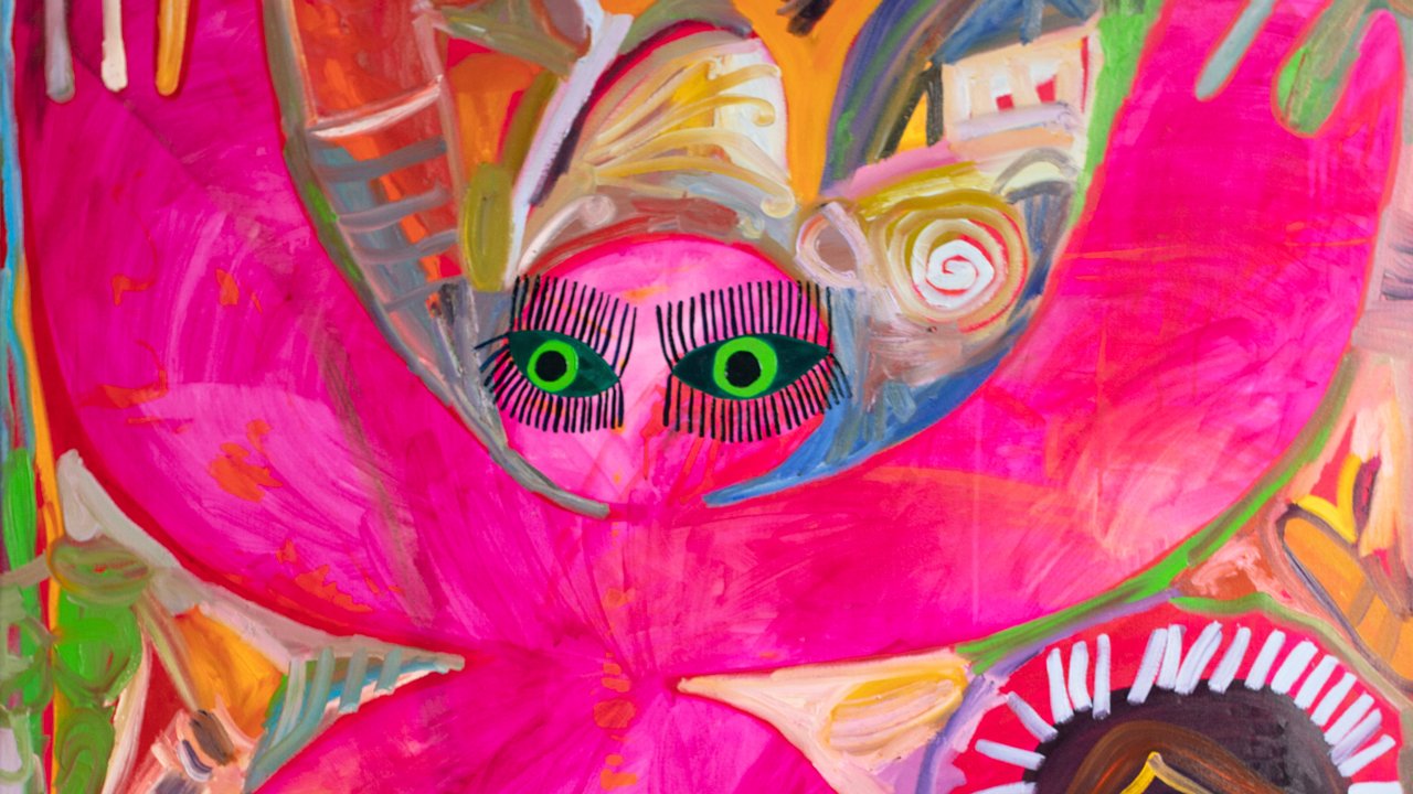
Charlotte Alldis

Like an imaginary friend, the protagonist in Charlotte Alldis’ artwork, “Transference”, stands dominant in the frame, as mythical and bulbous as a child’s mind would allow. Backdropped by a jungle of technicolour contours, the central composition of the playful figure almost serves as a triptych with each limb dividing the piece into panels. Each background imparts its own youthful narrative as the character mesmerises the viewer with their outstretched movements and spiderleg eyelashes. It’s the kinetic zest that radiates most about the work. “Colour dominates the visual space in my works and brings a lot of energy,” Alldis says. “I could spend all day mixing paints.” This verve is perceptible in the uniqueness of her creature. According to Alldis, this piece was born during a time when she would “paint to get inside my body and out of my brain”. “It came to me quickly, as if it was ready to exist,” she recalls. “The largeness of the character is magnetic, it’s much bigger than me in real life. It feels like I painted this strong character to protect me – it feels playful and silly but also determined and fierce.”
THIS FEATURE IS PUBLISHED IN THE 19TH EDITION OF GRAZIA INTERNATIONAL. ORDER YOUR COPY HERE.